


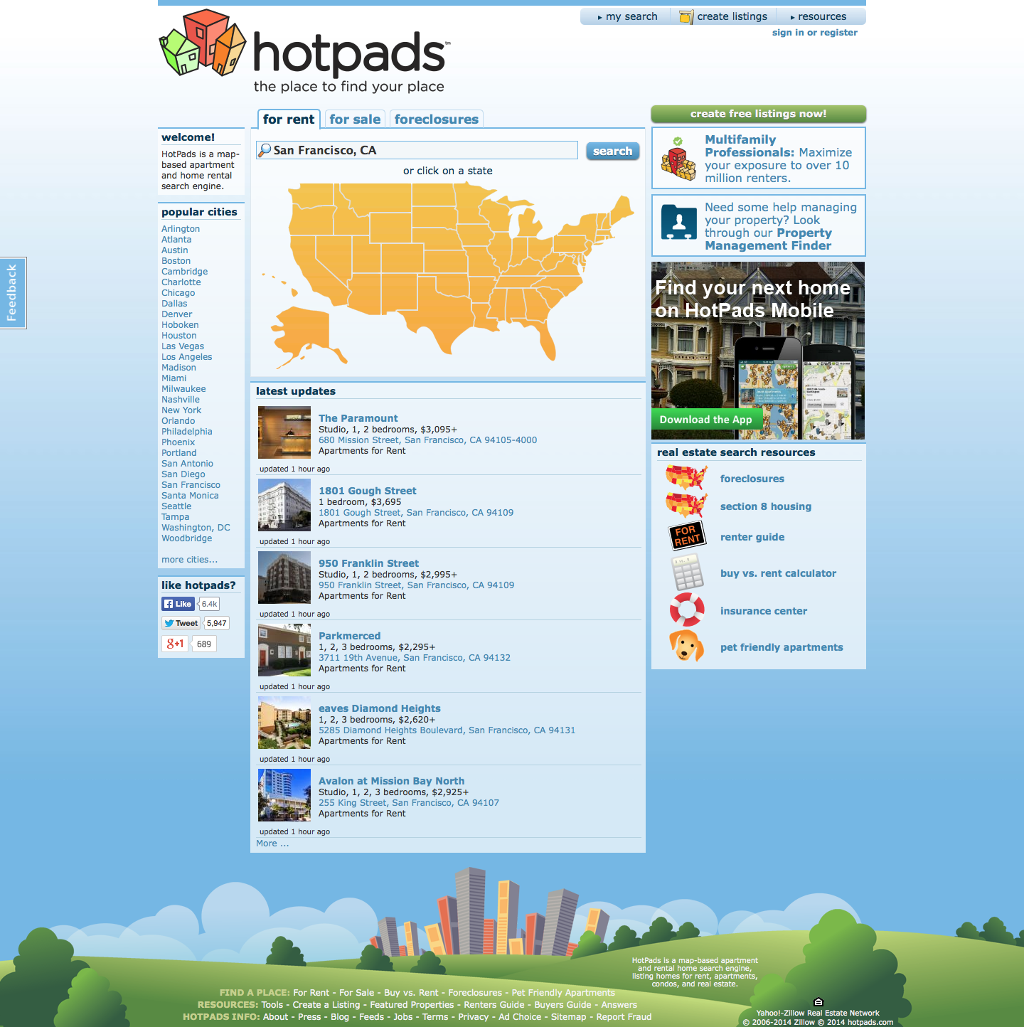


In this screen capture, I focused on demonstrating a potential user flow through Hotpads. It starts from the homepage where the product is introduced along with an explanation of key features. The video goes on to demonstrate how a combination of map and list views coupled with property filtering and a unique use of Google's street view creates a great search experience.
This feature was intended to extend property visibility outside of the core product. These cards could be embedded on 3rd party websites and in the hotpads blog.
A branded map with simplified property markers was proposed over the use of building icons. My focus was put on a better display of a property's location and highlighting a verified listing over a particular building type. The user insight driving this decision was that the majority of people looking for a home consider the listing's location or neighborhood before considering other distinguishing factors.
On the map, verified listings received special treatment in the form of a red check. The idea behind the distinction was that users care more about quality over quantity when considering which listings to spend time investigating further.
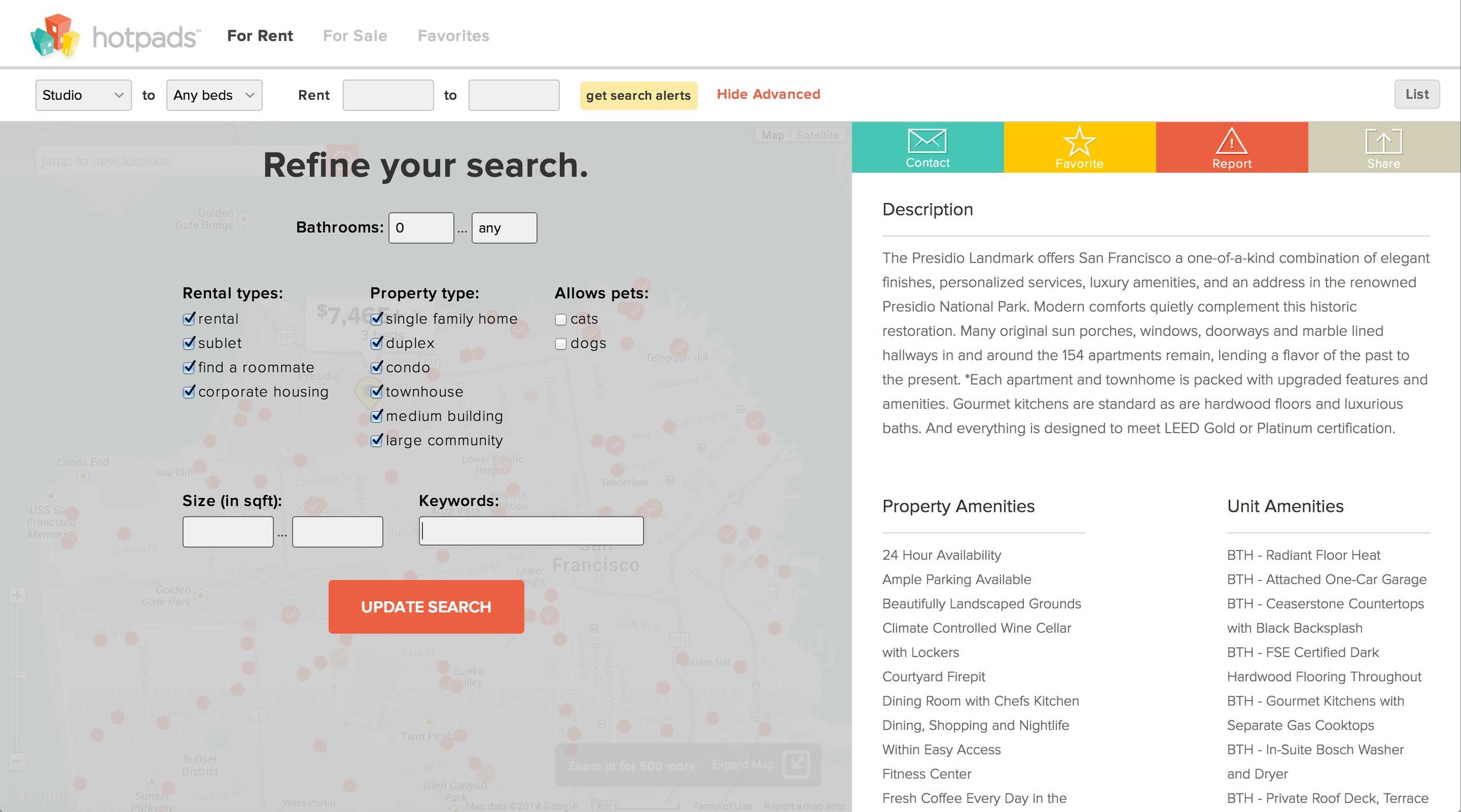
Giving users controls to organize their apartment hunt while they dive into the details of a listing was a major point of the redesign. Here the action bar snaps into place and remains accessible throughtout a user's scroll of the listing details panel.
Listing filters were already a part of hotpads, but they took up a lot of screen real estate and added to the visual noise of the page. The recommendation was to only show the most important filters up front and present the more granular controls via a modal that could be easily accessed when needed.
While street view is not a true hotpads feature per say, the way in which it was implemented into the UI was a novel offering. Never before was a user able to see an apartment's interior while simultaneously being able to virtually explore its surrounding neighborhood.
The foundation of the mobile web app carried over into the company's native Android and IOS apps.
This conceptual mood piece was proposed to be used on the homepage.
In the market for a new apartment? Give hotpads a try.
In this view, the user controls and filters are largely invisible. I focused on making the user controls more visible while simplifying and styling the map to fit the brand's visual refresh. I experimented with typography and white space to strike the right balance and create harmony between the UI elements.
Here, I focused on trimming the horizontal side panel from 2 columns to 1, which allowed for a more inviting display of the map and a cleaner hierarchy of information. The listing controls were standardized and each given a specific color, which evolved into the action bar. All of that, a little typography, and whitespace greatly improved the efficacy of the listing detail view.